

The goal is to make films accessible and educational.
OVERVIEW
THE TEAM
TEAM SIZE
Three Members
DURATION
Five Weeks
METHODS
User Survey, Competitive Analysis, Literature Review, Sketching, Prototyping, Proto-personas
AN INTERACTIVE EXPERIENCE
FOR STUDENT NETFLIX USERS
DESIGN OBJECTIVE
As technology changes, so too does the traditional classroom experience. More and more often, educators are attempting to use new media to engage their students in ways a traditional book or lecture is unable to. Often times this new media involves some form of video content or movies. Despite the increased usage of movies and videos in classroom settings, there is an overall lack of accessibility to this essential content, causing unnecessary struggle for educators as they attempt to find the content that best suits their curriculum, and even more struggle for students as they struggle to revisit the content shown to them in class.
The purpose of this case study was to enhance the role of film in education and understand the ways in which the original design and features of Netflix could be improved to better fit the needs of students and teachers. As the problem presented above demonstrates, there is an opportunity to be explored in regards to addressing the needs of teachers and students as they utilize video resources in classrooms, and as such, our team sought to find the most effective solution to maximize the educational benefits gained from the movie viewing experience. In pursuing this new extension of the Netflix service, our team’s goal was to bridge the gap between movies and the classroom, creating a more interactive viewing experience that mimicked the collaborative and participatory experience offered in an in-class school experiences, all while staying true to the original appeal of the Netflix aesthetic and interface.
PROJECT CONCEPT
Our solution to this problem of video content accessibility for educational purpose is to create an extension of the Netflix Service catered specifically to the needs of educators and students which would be called the Netflix Student Essentials plan. As Netflix offers several different plans, each offering different features and priced in accordance to what features are offered, the Student Essentials plan would be an additional plan offered only to individuals with a valid University email address and would be offered at a lower price than the standard Netflix plan. This plan would give users access to a comprehensive video library containing a host of educational video content that can enhance the learning and teaching experience. The final application would be considered a merging of the original Netflix viewing experience with the interactive classroom features provided by educational services such as Canvas and Blackboard, allowing teachers to assign a schedule of films to watch, complete with assignments and discussions that can be completed in the app. Such features would elevate the video viewing experience, allowing both educators and students to get the most out of their video content.
“The way we learn and teach is changing more and more everyday, but teachers and students aren’t equipped with the resources they need to successfully make these changes”
USER RESEARCH SYNTHESIS
For this stage of our project development, our team initiated our research by determining our general target audience. As we were developing an application to be used for college educational purposes, we determined that our target audience could be divided into two groups: college students and college professors. After determining our project’s target audience, we then moved onto several different forms of user research, starting with a brief literature review.
In our literature review we consulted a study conducted by LedEDU, wherein it was found that only 8% of college students did not have access to a Netflix account, meaning that 92% of students did have access to a Netflix account whether that be directly through their own paid account or through a friend’s. Additionally, this study reported that a majority of the students that had access to a Netflix account stated that the service was useful in their educational careers. This study was especially helpful in allowing us to gauge the necessity and relevance of our project, helping us to understand the viability of our problem space.
From here, we then conducted a preliminary user survey which allowed us to gain insight into the relevance of film in the educational careers of college students, how they interacted from this content, and how they feel they could better enhance their experience with this content. Our survey was conducted using a sample of five college student at the University of Colorado Denver, with an age range of 19-25. These survey were conducted via text and consisted of a series of questions including whether or not the participant currently had a Netflix account, how often they used it, how often they watched films for classes, how they could better learn from films shown in classes, and other questions that allowed us to gather insights into how we can best design this app to cater to their educational needs.
The quantitative data we gained from this research allowed us to gain an overall summary of the relevance of a student oriented Netflix service. Our research concluded that a hundred percent of participants had access to a Netflix accounts, averaging about an hour of screen time a day, reinforcing the importance of Netflix in student lives. Additionally, four in five of our participants stated that they would utilize a video streaming app if it could be used as a graded assignment.
Qualitative data was then useful in understanding what features this application should incorporate and how it should be designed. The majority of participants responded that they would prefer a user experience that was as close to the original Netflix interface as possible, while still including more classroom oriented organization. Participants also stated that an interactive viewing experience would be useful in order to enhance information retention, suggesting features such as highlights of themes to focus on, or quizzes to summarize and reinforce the content that was taught.
PROTO PERSONAS
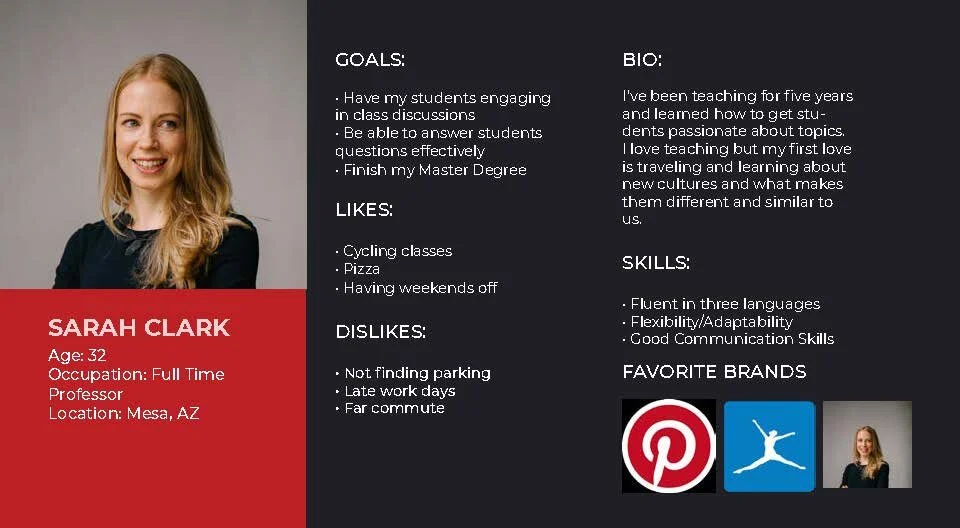
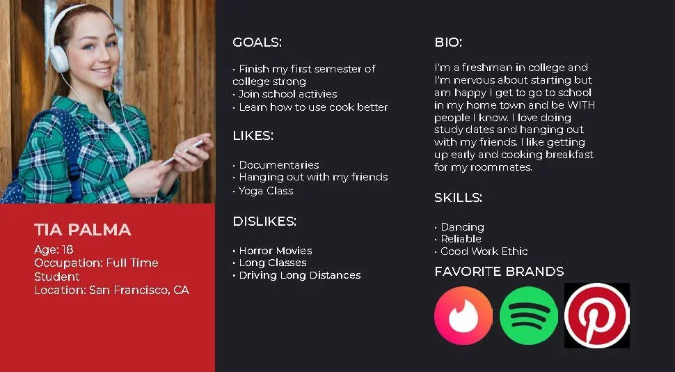
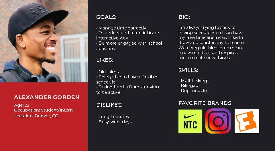
From our initial user research, we then went on to develop three user personas, two of which were meant to represent our student audience and the third to represent our faculty audience.
Our student personas, Alexander Gorden and Tia Palma demonstrated the general student audience we wanted our application to cater to. As such, the goals of these two personas focused on the advancement of their educational careers, engaging in school activities and getting the most out of their education. These students are both interested in exploring new ways of learning educational content and are driven to learn and explore new topics.
Our faculty persona, Sarah Clark, is also representative of a group of individuals that want to improve upon the traditional classroom experience and utilize new and engaging media so as to provide the most beneficial learning experience for her students. She is passionate about her career and seeks to engage her students in the content she is teaching.
COMPETITIVE ANALYSIS
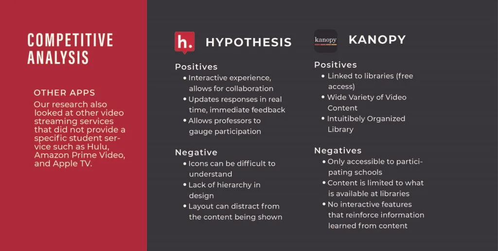
Our competitive analysis consisted of two phases of research wherein we initially focused on Netflix’s direct competition and then later moved on to analyze indirect competitors that offered useful features that could be integrated into our final product.
Our initial phase of competitive research focused on direct competitors including other video streaming services such as Hulu, Amazon Prime Video, and Apple TV. This phase of our research served mainly to gain insight into what was already being offered by other similar service if they offered any form of student oriented plans. As such, we focused on aspects such as pricing and available content for student plans. While we found that Netflix did not offer any kind of student plan, we found that Hulu and Amazon did, which consisted of lower pricing than their standard plans, with access to their entire video libraries. No features were offered that were specific to a student experience.
We then went on to analyze the features offered by indirect competitors which were not exactly video streaming service but which were services that catered to educational needs and were useful for the usage of video content in an educational setting. The two competitors we reviewed were Hypothesis and Kanopy which we analyzed in terms of their positive and negative qualities so as to gain insight into what successful features could be utilized and implemented in our own designs.
We found that Hypothesis, an extension that could be used by educators in order to allow students to discuss content on the internet directly on the original web page, was successful mainly in its ability to organize collaborative interaction of students both with the content assigned and with other students in the class. The overall design of the extension was considered the negative, as the lack of hierarchy made difficult to navigate its different functions.
Kanopy, a video streaming service that is free to individuals with a University email or library card, was successful mainly in its education oriented film content which consisted of a wide variety of films that could be used by educators and which could be accessed for free due to the services partnership with participating libraries and colleges. The negative aspects of this service was the lack of interactive capability, only allowing a traditional viewing experience, as well as the limited accessibility of the service, as only participating colleges and libraries could access the free content.
USER JOURNEY MAP
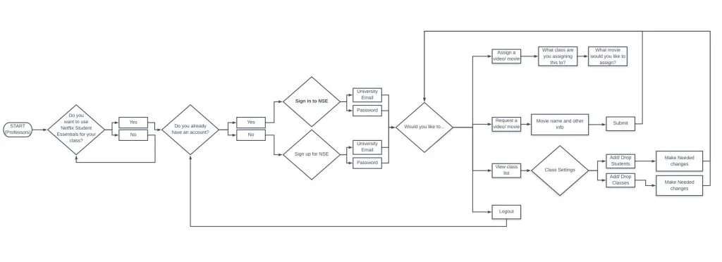
Faculty User Journey Map
In order to better understand the way in which our application would be organized and navigated, the team crafted user journey maps for both of our target audiences. The faculty journey map focused on the process of signing up for the account and then setting up a course. This process involved, logging in or creating an account, and then planned through the navigational experience of performing the actions of requesting a movie from Netflix, creating course shells, grading assignments, adding assignments and creating quizzes or discussions, as well as viewing class information such as who is in the class and adding or dropping students.
The student journey map focused on the process of creating an account, wherein a student would choose the student plan, enter their student email and begin entering their college information. From there, they could join classes, view assignments from their enrolled courses and complete assignments as they watch movies.
LOW FIELITY DESIGNS
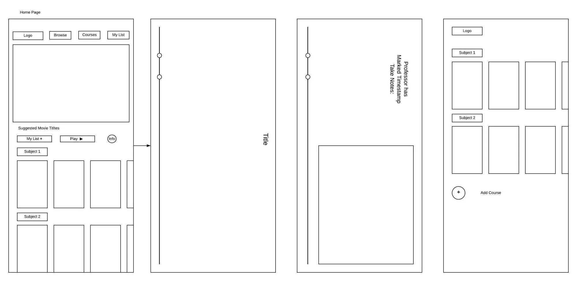
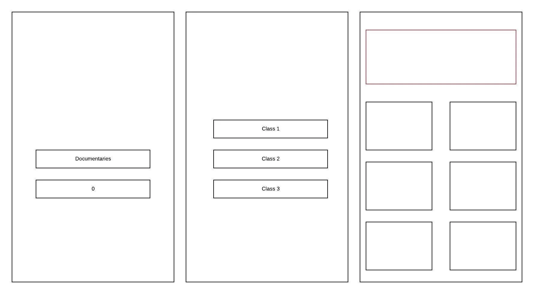
The Team’s initial lo-fi designs (left) and their secondary, revised lo-fi designs (right)
Our team began the design phase of our project by developing low fidelity screens for our overall app design. The three wire frames on the left were our team’s initial design that focused on organization of content without any intention to show the specialized student content of the app. Our wire frames on the right served as a more developed overview of the organization of our application, the first screen being the homepage as it appears for the student version of the app, the second and third screen demonstrating the interactive viewing experience feature of the app as it allows teachers to mark timestamps in the movie to take notes during, and the fourth screen demonstrating the organization of course content.
HIGH FIDELITY DESIGNS
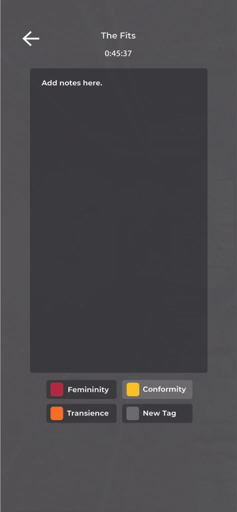
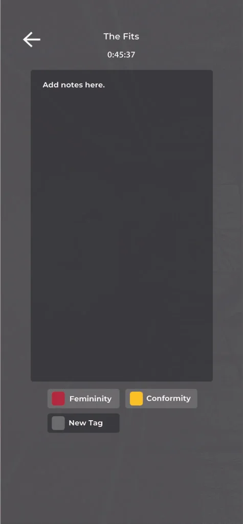
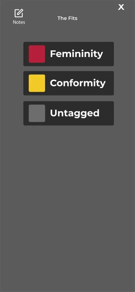
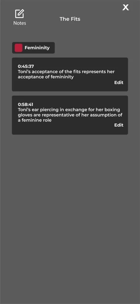
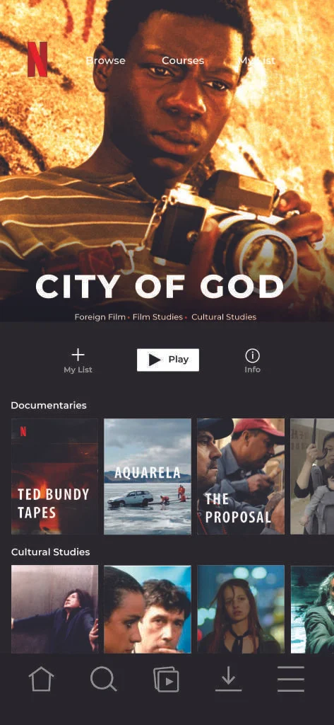
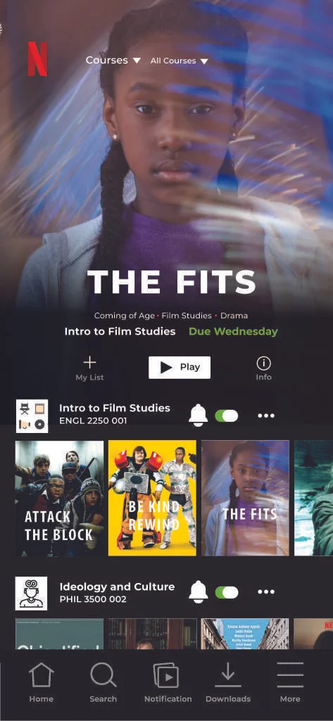
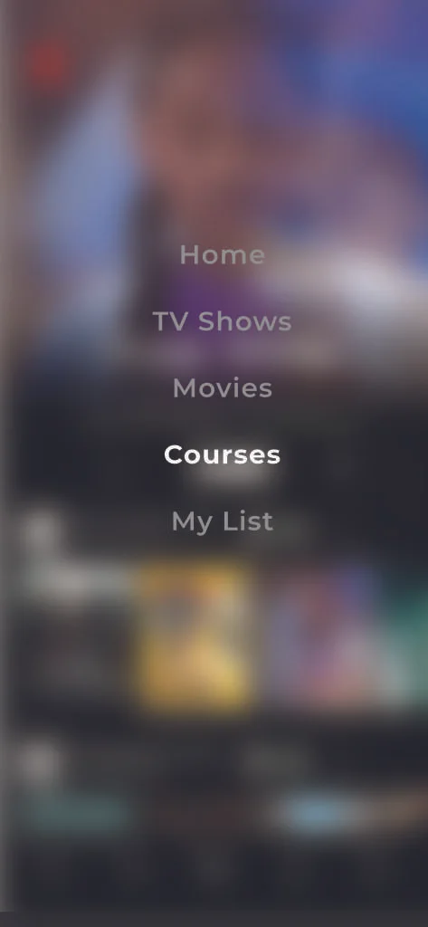
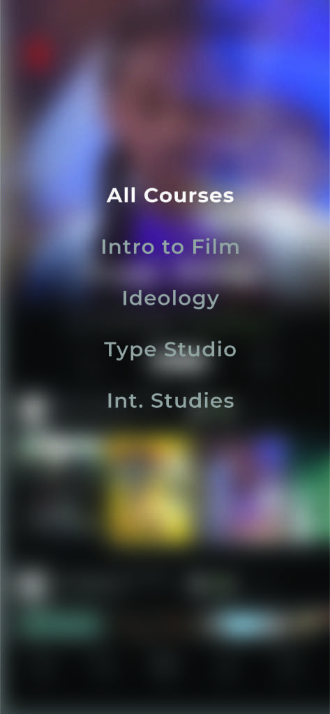
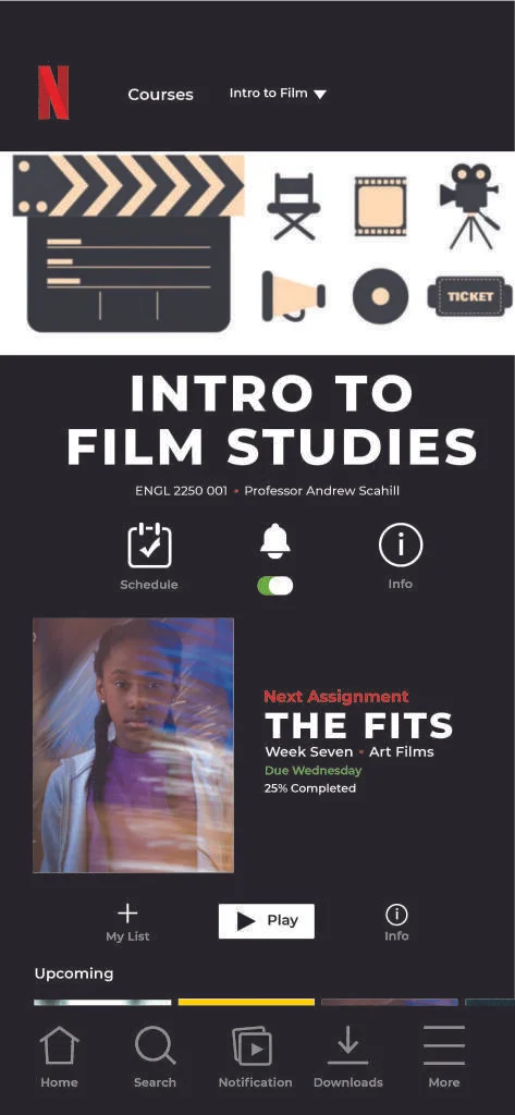
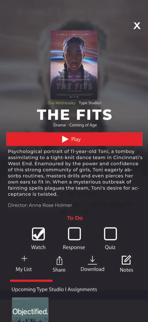
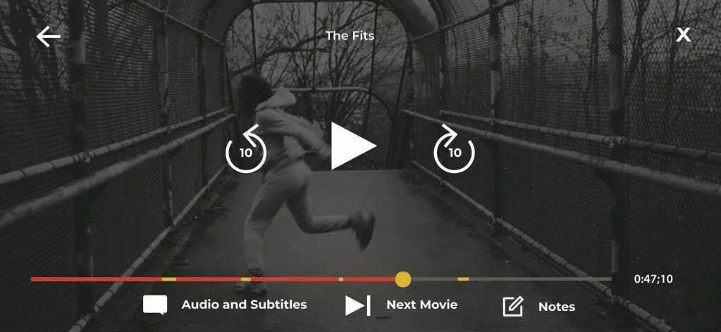
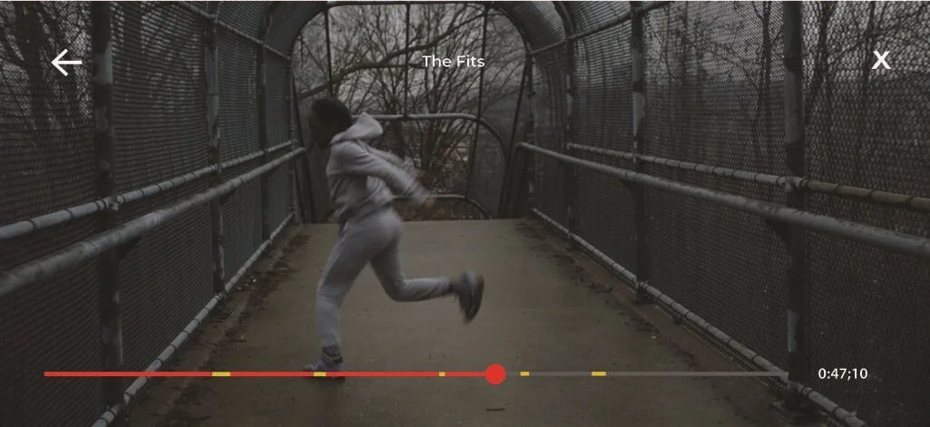
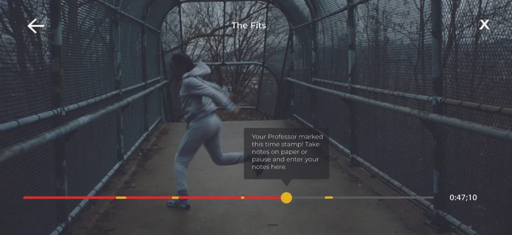
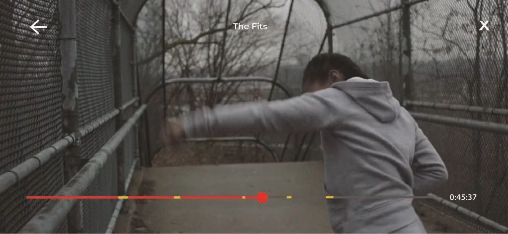
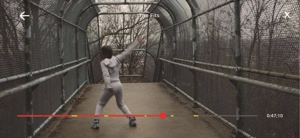
The designs provided above include the screens that are original to our Student Essentials designs. The first four screens demonstrate the interactive nature of our application’s note taking experience, the first two demonstrating the in-movie app taking feature that can be accessed through the paused movie screen menu shown in the eleventh screen, while the third and fourth note screens demonstrate the ability to access notes taken for a movie which can be sorted through tags and accessed via the notes button on the assignment overview screen on the tenth screen. The eleventh through fifteenth screens demonstrate the movie viewing experience in our app, the fourteenth screen demonstrating the ability of the professor to mark timestamps in the movie to remind students to pay attention and take notes. The sixth screen is the courses overview page, allowing students to view all the courses they are currently enrolled in along with an overview of the assignments due for those classes. The ninth screen is a single course overview page which gives an overview of a specific course, the example above being the film course, giving an overview of general course information, the assignments to come, and highlighting the most recent assignment.
RETROSPECTIVE
KEY CHALLENGES
In completing this project, my team ran into several different obstacles that were most largely concerned with our ability to organize and synthesize our design visions and ideas into a single unified concept. While we has all originally agreed on a single concept, we all had different ideas as to how we could complete our goal, and often struggled to meld these differing ideas into a final design. The lack of ability to clearly communicate these ideas over text and email further complicated this issue as often pieces of the final designs were done by different members and therefore carried some form of variance from designer to designer. We reconciled this issue by taking time to review our design all together, in person, reconciling the differences that made our designs inconsistent and discussing how to avoid inconsistencies as we moved forward.
In term of the creation of the design, it was a struggle to develop a user experience that was a simple and intuitive as the original interface so as to not confuse users. The idea of creating an interactive movie viewing experience was reported to be essential for student users, but attempting to make the experience as seamless and intuitive as possible was difficult when considering all the interactive features which would only further complicate the design. As such, we as a team had to determine the best way to organize these features and how to most effectively incorporate them into the experience without creating a product that was too complicated and cluttered for a user to interact with.
KEY INSIGHTS
From this experience, our team determines that this product is a viable concept and would be relevant to the current educational experience, speaking to the survivability of the product.
From this experience I have learned a great deal about the process of research and the usefulness of including preliminary user research and testing rather than gaining insight solely from literature reviews and previously completed research on a desired target audience. Completing preliminary user research firsthand allowed us to obtain insight into more recent data from individuals that we could revisit and continue to question in order to complete and develop our designs. This research was truly useful in advising the direction of our designs so as to best cater to our user’s needs
The critique our team received during our presentations also reminded me of the importance of understanding the context from which our product would be viewed, as we had not originally considered the usage of our service on other devices such as TVs and computers, which is something we should have taken into account in our initial research and planning. Had we had more time to develop our project, we would have looked more into the formatting of our product for different devices and would have done more work to plan out how interactive features would translate to these new formats.